Adding a Dropdown Field
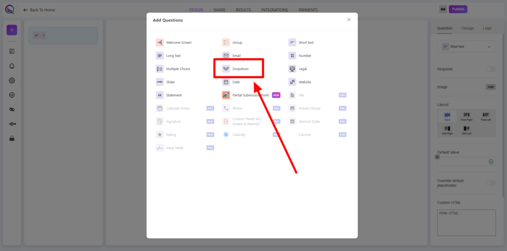
To include a dropdown field in your form, click on the “+” icon to add a new block. From the list of available field types, select Dropdown.
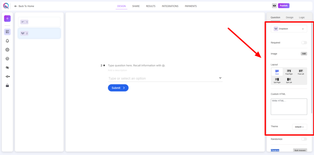
Content Customization
- Required (On/Off): Toggle whether the dropdown selection is mandatory for users before proceeding.
- Add Image: Attach an image to the dropdown field to provide additional context or enhance its visual appeal.
- Layout: Adjust the arrangement and positioning of the dropdown field to match the overall form design.
- Custom HTML: Add custom HTML elements for greater flexibility in styling or functionality.
- Design & Styling Options
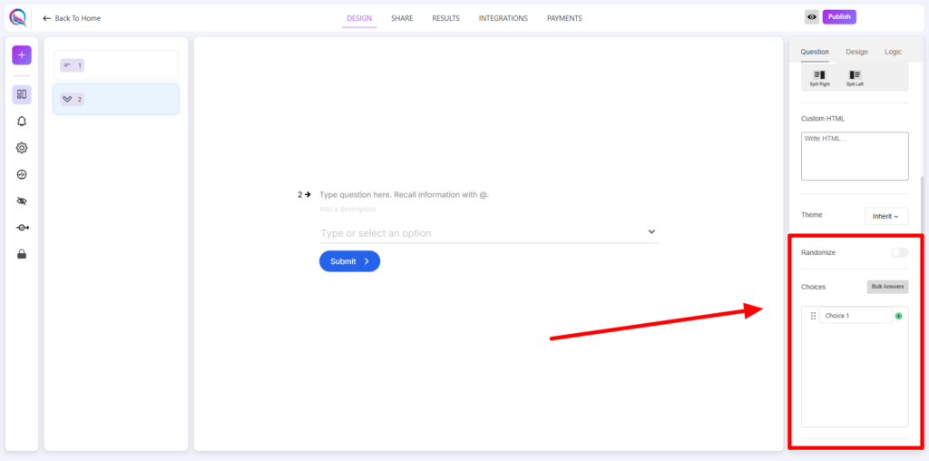
- Theme (Inherit/Override): Choose to either inherit the global form theme or apply custom styles specifically to the dropdown field.
Behavior & Functionality
- Randomize (On/Off): Enable randomization to shuffle the order of dropdown choices for each user. (Note: Randomization does not apply in preview mode.)
- Choices: Define the selectable options within the dropdown list. Use structured input to ensure clarity and ease of selection.
- Bulk Answer Button: Quickly add multiple choices at once using the bulk answer option, streamlining the process of populating the dropdown list.
Best Practices
- Keep dropdown options concise and meaningful for better user comprehension.
- Use the Bulk Answer feature to efficiently manage large sets of choices.
- Consider enabling Randomization when order bias may influence responses.
- Utilize Custom HTML for advanced styling and interactive enhancements.
Dropdown fields are perfect for structured selection-based inputs, offering an efficient and user-friendly way to collect responses!


