To begin, click on the “+” icon to add a new block to your form. From the list of available options, select Calendar Picker.
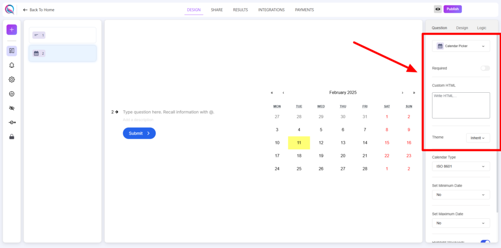
Field Customization
- Required (on/off): Enable this option to make date selection mandatory.
- Custom HTML: Insert custom HTML elements to enhance functionality or styling.
- Theme (inherit/override): Choose whether to inherit the global theme or override it with specific settings.
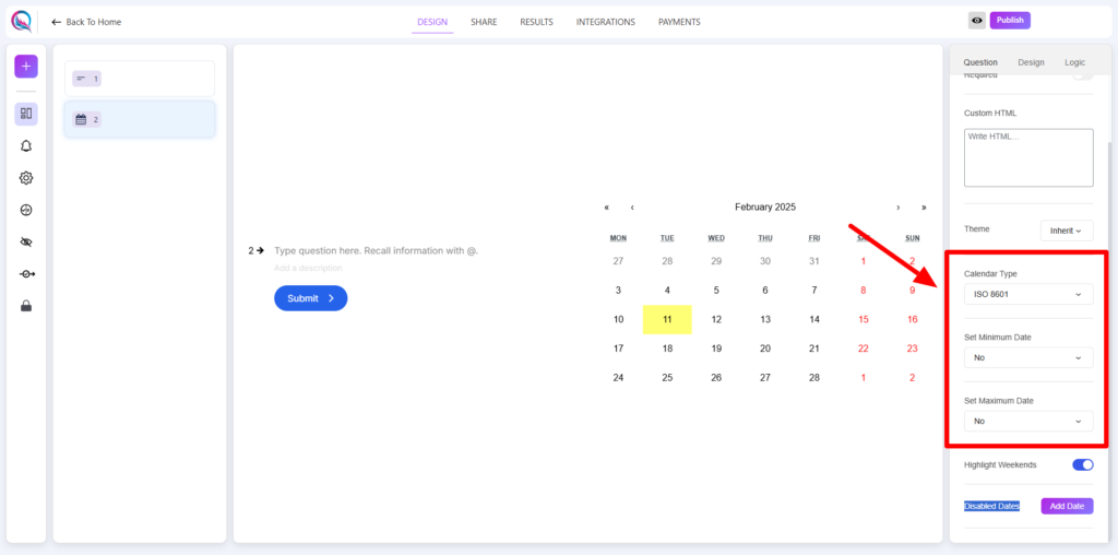
- Calendar Type: Select the format for date representation from multiple options such as ISO 8601, US, Arabic, or Hebrew.
- Set Minimum Date:
- No Specific Date: No restriction on the minimum selectable date.
- Dynamic Date: Set a dynamic date limit based on form logic.
- Set Maximum Date:
- No Specific Date: No restriction on the maximum selectable date.
- Dynamic Date: Define a dynamic upper limit for selectable dates.
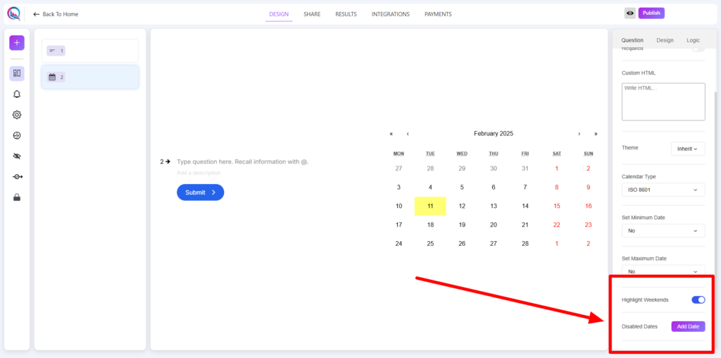
- Highlight Weekends (on/off): Enable this option to visually highlight weekends in the calendar.
- Disabled Dates: Specify certain dates that should not be selectable by adding them through the Add Dates button.
Best Practices
- Ensure that date selections align with the intended user experience.
- Use the Highlight Weekends option for forms that involve scheduling or booking.
- Utilize Dynamic Date settings to create flexible and interactive date selections.
- If using Disabled Dates, clearly communicate unavailable dates to users to avoid confusion.
The Calendar Picker allows users to select a date from a structured, interactive calendar while ensuring flexibility through customization options.


