Adding the Short Text Field
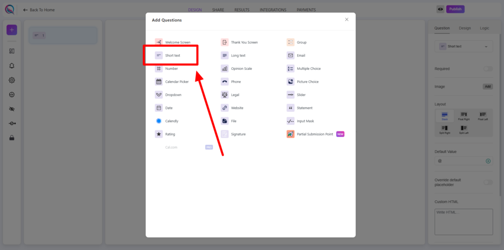
To begin, click on the “+” icon to add a new block to your form. From the list of available options, select Short Text.
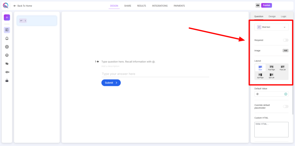
Field Customization
- Required (on/off): Enable this option to make the short text field mandatory.
- Add Image: Attach an image to accompany the field.
- Layout: Adjust the field layout to match your form’s design.
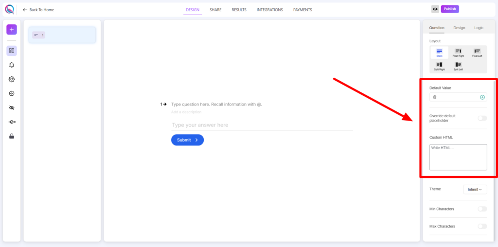
- Default Value: Pre-fill the field with a default input.
- Default Value Options:
- Score: Automatically assign a score value.
- User Username: Pre-fill with the user’s registered username.
- User Email: Pre-fill with the user’s registered email.
- User Display Name: Use the user’s display name as the default value.
- Override Default Placeholder (on/off): Enable this option to modify the placeholder text.
- Custom HTML: Insert custom HTML elements to enhance functionality or styling.
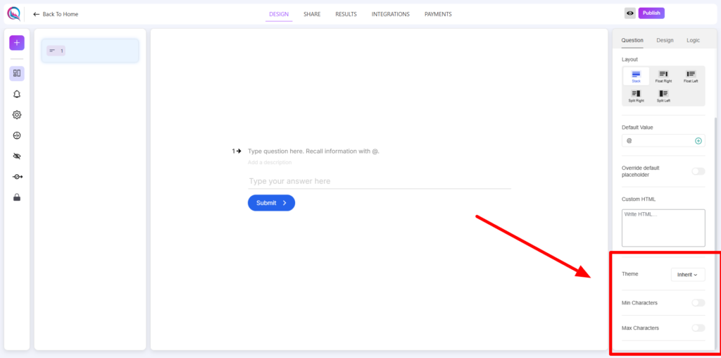
- Theme (inherit/override): Choose whether to inherit the global theme or override it with specific settings.
- Min Characters (on/off): Set a minimum character limit for user input.
- Max Characters (on/off): Define a maximum character limit to restrict input length.
Best Practices
- Use the Default Value option to streamline form completion by pre-filling known data.
- Enable Min/Max Characters to enforce input length restrictions where necessary.
- Utilize Custom HTML for added flexibility in design and functionality.
- Override placeholder text to provide users with clear guidance on expected input.
The Short Text Field is ideal for collecting brief inputs such as names, titles, or single-line responses efficiently.


