Overview
The Group block allows you to organize multiple form elements into a single section. This helps in structuring your form, making it more intuitive and visually appealing for users.
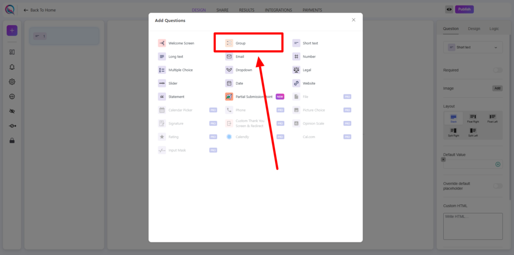
Adding the Group Block
To begin, click on the “+” icon to add a new block to your form. From the list of available options, select Group.
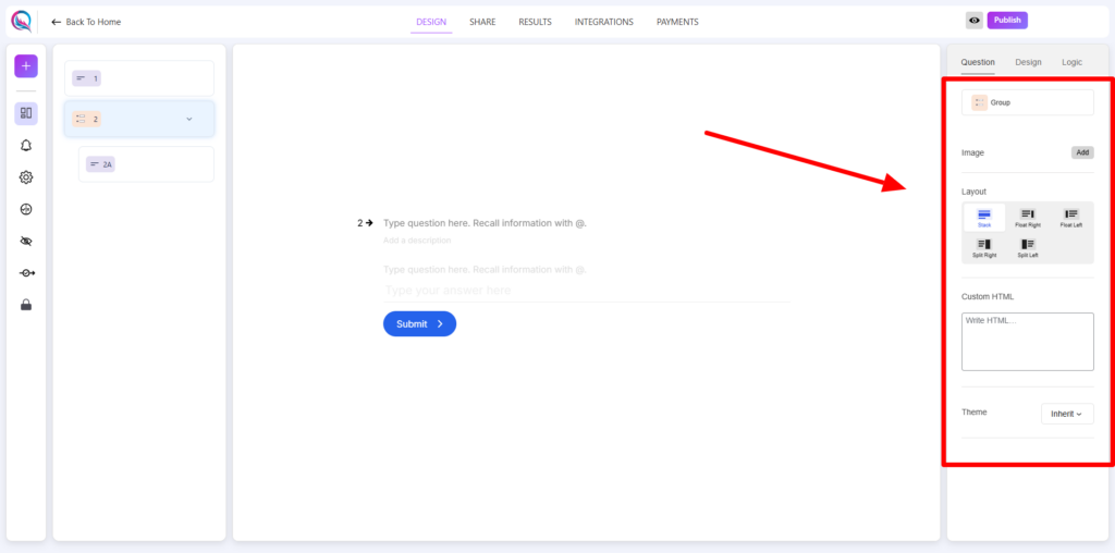
Content Customization
- Add Image: Enhance the group section by including an image to create a visually engaging experience.
- Layout: Choose how content is arranged within the group for better readability and structure.
- Custom HTML: Insert custom HTML elements to extend functionality or add unique styling.
- Theme (Inherit/Override):
- Inherit: Applies the global theme settings to maintain consistency.
- Override: Allows customization of theme settings for this specific group block.
Adding child blocks inside a group block
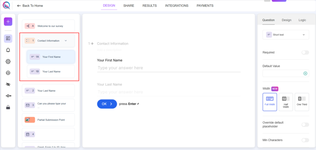
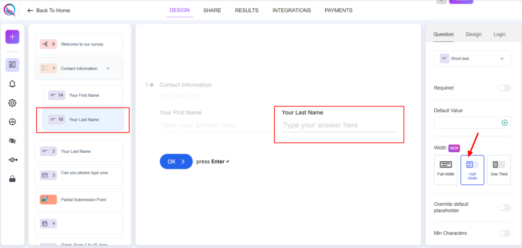
You can add any block inside the group block by dragging it to be inside the group block. You can also customize the width of children blocks. Think of it like having a grid system that enables you to have 2 columns per row or 3 columns per row like the following screenshot:
Best Practices
- Use the Group Block to organize related questions or sections within the form.
- Keep the layout clear and structured for an improved user experience.
- Control the width of the children blocks if you would like to have 2 questions per row or three questions per row.
- Maintain consistency by either inheriting the global theme or applying overrides where necessary.
The Group Block helps in creating well-structured and organized forms, making it easier for users to navigate through related sections efficiently.


